The Challenge
Diabetes is a prevalent condition that must be managed carefully. While visual tools in medical guidelines are effective for conveying clinical information, some traditional diagrams can be upgraded through applying information design principles. We collaborated with a knowledge transfer research team to seek alternative ways to present information regarding diabetes management.
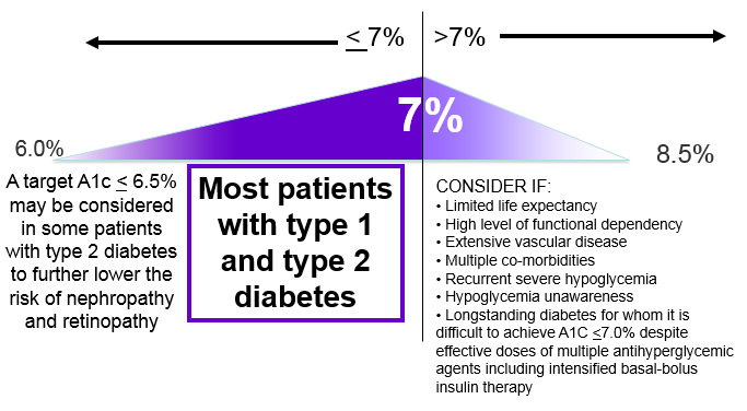
The existing diagram was designed to inform doctors about targeted glucose levels for three patient groups. Targeted glucose levels are:
- 6.0 – 6.5% (new patients)
- 7.0% (majority of patients)
- 8.0- 8.5% (older/sicker patients)
We compared the list of core information with the conventional diagram and identified potentially misleading components of the diagram for clarification. We then created conceptual sketches based on the core content and our critique, and developed the final diagrams while incorporating researchers’ input.
Prototypes
This presentation can be still misleading due to the conventional way of reading a quantitative graph:
- The x-axis requires clarification. Viewers may perceive group C as having a target of 7.0% – 8.5%.
- The y-axis can be misleading since no actual data is being represented.
- The x-axis is not quantitatively arranged.
Proposed solutions
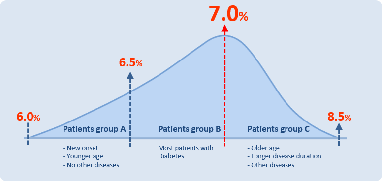
Since visualizing empirical facts with a coordinate graph can be misleading, we used a one-dimensional graph to represent the target glucose level and symbolically arranged the 3 patient groups.
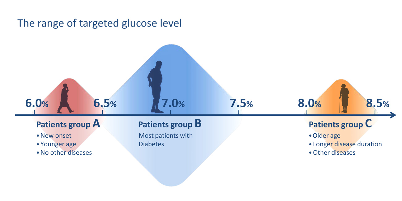
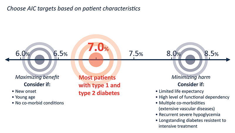 Another infographic solution based on the original graphics. The idea of “targeting” AIC was visually emphasized.
Conclusion
Infographics should clearly represent key messages and target specific audiences. Well-designed infographics can deliver information efficiently, which ultimately reduce training time and costs.